Intuitive design, built from real understanding

I'm Gustavo, a UX designer with 12 years of experience. I research, structure, and test digital products across banking, public services, SaaS, and hospitality. My work connects user needs to business goals with clear, validated design decisions.

See what I do
12+
Years designing end-to-end UX
60+
Projects shipped
100%
Focused on user outcomes

What I do

Twelve years of UX work across four areas of practice. Each one connects directly to how products get built, tested, and shipped.

Area 01

Design & Prototyping

  • Design user flows, wireframes, and high-fidelity prototypes
  • Lead ideation workshops: design sprints and stakeholder co-creation sessions
  • Validate design solutions through A/B testing and UX metrics analysis
  • Ensure product consistency across platforms (web, mobile, tablet)
Area 02

Research & Analysis

  • Plan and conduct user studies: interviews, usability tests, surveys, card sorting, A/B tests
  • Analyse qualitative and quantitative data to identify improvement opportunities
  • Create and maintain user personas and experience maps (journey maps)
  • Perform heuristic evaluations and accessibility audits (WCAG)
Area 03

Strategy & Leadership

  • Define and lead the product UX vision in collaboration with product, engineering, and business
  • Establish and maintain the design system and company style guide
  • Plan and prioritise the UX roadmap aligned with business objectives
  • Represent the design team in management and stakeholder meetings
Area 04

Team Management

  • Mentor and develop junior and mid-level designers on the team
  • Conduct design critiques and provide constructive feedback
  • Manage project assignments and team workload
  • Participate in the hiring and onboarding of new designers

Companies I have worked with

A selection of organisations across government, banking, technology, and energy.

Selected work

Three end-to-end projects across enterprise software, mobile banking, and public administration. Research-driven from discovery to final delivery.

Case Study · Enterprise UX

TMS for Hotels
PMS Redesign for Indra

SAP-based Property Management System · Agile · Multi-hotel operations

User ResearchCard SortingInteraction DesignShadowing & InterviewsMid-fidelity PrototypingUsability TestingAgileSAP / PMS

Context

As part of a digital modernisation initiative for Indra, I led the redesign of a SAP-based Property Management System used by hotel staff to manage reservations, occupancy, and operational workflows across multiple hotel areas. The platform had evolved without a consistent interaction model, resulting in a tool perceived as difficult to navigate, visually outdated, and cognitively demanding during daily operations.

Environment
Agile
Cross-team collaboration
System type
SAP PMS
Hotel operations tool
My role
UX Lead
Research to validation

Process

01
Discovery — shadowing & interviews

Conducted shadowing sessions with hotel staff to observe the system in real operational environments. Complemented with user interviews to identify pain points and understand how users had adapted their workflows around system limitations.

02
Synthesis — card sorting & IA

Organised card sorting exercises to evaluate how users mentally grouped information and operational tasks. This redefined the navigation architecture and established clearer relationships between sections across a highly complex system.

03
Design — mid-fidelity prototype

Developed a mid-fidelity prototype focused on validating structure, workflows, and interaction patterns early, before visual refinement. It served as a shared design language across product, UI, and development teams throughout iterations.

04
Validation — usability testing & benchmarking

Once final designs were completed, usability sessions compared the redesigned experience against the previous version using both qualitative feedback and quantitative metrics, confirming improvements across key flows.

"Navigation complexity and inconsistent information grouping were increasing task completion time and creating unnecessary cognitive load, especially during high-pressure operational moments."

Outcomes

Navigation comprehension

Clearer IA and restructured groupings reduced orientation effort across all tested user segments.

Task efficiency

Interaction patterns validated through iterative testing shortened key operational workflows measurably.

User confidence

Staff reported higher confidence and lower cognitive load when performing high-pressure daily tasks.

Design system foundation

The mid-fidelity prototype enabled the UI team to build a consistent, scalable visual design system from validated structural decisions.

Case Study · Mobile Banking

New Banking App
Research & Experience Redesign for Banc Sabadell

Mobile Banking App · Digital-first · Personal Finance

Competitive BenchmarkingMid-fidelity PrototypingA/B TestingUsability TestingUser QuestionnairesInteraction Design

Context

For Banc Sabadell, I contributed to the redesign of the bank's mobile application as part of a broader effort to modernise the digital banking experience and align the product with evolving user expectations. The objective was not limited to updating the visual layer of the application, but to rethink how users interacted with financial information, savings tools, and everyday banking features in a more intuitive and engaging way.

Platform
Mobile
iOS & Android
Focus area
Finance UX
Savings & engagement
My role
UX Designer
Research to prototyping

Process

01
Evaluation — existing application audit

The project started by evaluating the limitations of the existing application, which users perceived as functionally dense and visually outdated compared to emerging digital banking competitors. The redesign explored new functionalities to strengthen user engagement around personal finance and saving behaviours.

02
Research — competitive benchmarking

Conducted competitive benchmarking across traditional banks and digital-first financial products. The objective was to analyse how other platforms approached savings experiences, financial visibility, onboarding flows, and feature discoverability. This research identified recurring interaction patterns and exposed gaps between feature availability and actual usability in competing solutions.

03
Design — mid-fidelity prototyping

Developed mid-fidelity prototypes to evaluate different approaches to navigation, savings-related features, and information hierarchy before moving into visual refinement. Working at this level allowed faster iteration and encouraged more focused discussions around usability and behaviour instead of aesthetics alone.

04
Validation — A/B testing, usability & questionnaires

The validation process combined A/B testing, usability testing sessions, and user questionnaires to understand both behavioural responses and subjective perceptions of the experience. These activities evaluated how users interpreted financial information, which visual approaches generated more trust, and how discoverable new functionalities felt within the application structure.

"Research findings frequently challenged internal assumptions about user priorities, particularly the balance between simplicity and feature visibility. Some concepts initially considered valuable introduced unnecessary cognitive load, while smaller interaction adjustments had a stronger impact on perceived usability."

Outcomes

Research & decision framework

Delivered a detailed research and decision-making framework that guided the continuation of the redesign process.

Validated product priorities

Work helped establish clearer product priorities grounded in user evidence, supporting future design decisions with qualitative insights and measurable validation.

Reduced cognitive load

Identified and removed features that introduced unnecessary complexity, improving perceived simplicity across key user flows.

Interface direction

Prototypes and research outputs directly informed the visual and interaction direction adopted in the final redesign.

Case Study · Public Administration

Procedures Web Portal
Service Experience Redesign for Generalitat de Catalunya

Public Services Portal · Accessibility AA · Citizens & Administrative Workers

Information ArchitectureCo-creation WorkshopsAccessibility (AA)Design SystemHigh-fidelity PrototypingResponsive DesignInteraction Design

Context

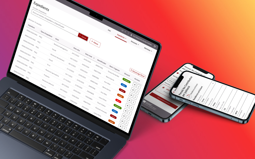
I worked on the redesign of the public procedures portal for Generalitat de Catalunya, a platform used by both citizens and administrative office workers to access, manage, and process public services. The existing experience had become difficult to navigate due to fragmented information structures, inconsistent interactions, missing critical information, and an outdated interface that added friction to already complex administrative processes. The challenge extended beyond visual modernisation. The portal supported a wide range of procedures with different legal requirements, user profiles, and operational rules, which created complexity for both citizens trying to complete tasks independently and internal workers managing requests.

Audience
Dual
Citizens & public workers
Standard
WCAG AA
Full accessibility compliance
My role
UX Designer
IA to high-fidelity delivery

Process

01
Audit — existing portal evaluation

Assessed the current portal to identify usability failures, information architecture fragmentation, inconsistent interaction patterns, and accessibility gaps. Issues originated not from isolated interface problems, but from fragmented patterns and unclear expectations between procedural sections.

02
Collaboration — workshops & co-creation

Facilitated frequent workshops, co-creation sessions, and validation meetings with functional and business analysts to align user needs, administrative requirements, and technical constraints. These sessions uncovered inconsistencies between documented processes and real operational behaviours, allowing the team to refine user journeys with a more realistic understanding of how services were actually experienced.

03
Design — IA & design system evolution

Improved information architecture and interaction consistency across different procedural areas. Worked extensively with the existing design system, maintaining and evolving components to support better modularity, accessibility compliance, and visual coherence. Rather than treating the design system as a static library, the process involved adapting it to new functional requirements while ensuring scalability for future services.

04
Delivery — high-fidelity & responsive prototypes

Delivered high-fidelity designs, interactive prototypes, and responsive versions optimised for mobile devices. Accessibility considerations were integrated directly into the system through reusable patterns that supported keyboard navigation, readable structures, consistent feedback states, and responsive adaptability.

"One of the main objectives was to improve clarity, accessibility, and consistency without oversimplifying the procedural logic required by public administration services."

Outcomes

Navigation predictability

Restructured IA and consistent interaction patterns improved how users moved through procedural areas, reducing confusion and task abandonment.

Accessibility compliance

Full alignment with WCAG AA standards across navigation, content hierarchy, contrast, typography, and responsive behaviour for a broader range of users.

Scalable design system

Evolved the design system with reusable, accessible components ready to support future services without requiring redesign from scratch.

Dual-audience clarity

Improved usability for both citizens completing procedures independently and administrative workers managing requests on the back end.